# Bootstrap IV 😮😮

Hey everyone!

We're at it again with <b> bootstrap IV!!!! </b>

We're going to discuss cards, dropdowns, navbars, collapse and carousels


<h5><i>Cards:</h5></i>

A card is a bordered box with some content usually to describe a part of the website.


A card is basically created with the <code> .card</code> class, the content inside the card has a <code>.card-body</code>


![basic card.png](https://cdn.hashnode.com/res/hashnode/image/upload/v1626548379303/d2BFNuc5eK.png)

A card also has a:
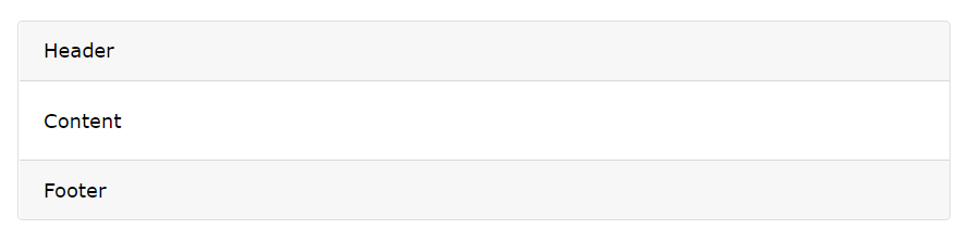
<code>.card-header</code>: adds a heading to the card


<code>.card-footer</code>:  adds a footer to the card


![head and foot.png](https://cdn.hashnode.com/res/hashnode/image/upload/v1626548387720/rejSHkuUj.png)

<code>.card-title</code>: add card titles to any heading element


<code>/card-text</code>: remove bottom margins for a <p> element 


<code>.card-body</code>: contains the body of the card


<code>.card-link</code>: adds a blue color to any link, and a hover effect.



![links cards.png](https://cdn.hashnode.com/res/hashnode/image/upload/v1626548430654/S57omatUd.png)

<code>.card-img-top</code>: place the image at the top or at the bottom inside the card

<code>.stretched-link</code>: class to a link inside the card, and it will make the whole card clickable and hoverable


![stretched link.png](https://cdn.hashnode.com/res/hashnode/image/upload/v1626548446692/4TznxjgB2.png)


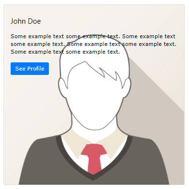
<code>.card-img-overlay</code>: turn an image into a card background 


![overlay.png](https://cdn.hashnode.com/res/hashnode/image/upload/v1626548462245/RCwqImaOc.png)

<code>.card-columns</code>:creates a masonry-like grid of cards


![colums.png](https://cdn.hashnode.com/res/hashnode/image/upload/v1626548472266/564A8EUMH.png)


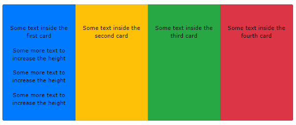
<code>.card-deck</code>: creates a grid of cards of equal height and width

![cardgroup.png](https://cdn.hashnode.com/res/hashnode/image/upload/v1626548503398/lpuGOnUI7.png)


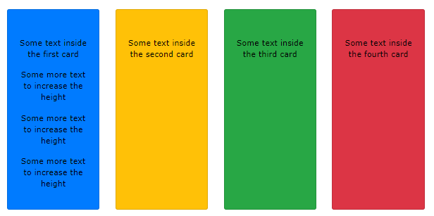
<code> .card-group </code>: removes spaces between cards and sandwiches them together


![carddd.png](https://cdn.hashnode.com/res/hashnode/image/upload/v1626548486717/6-kiapsUO.png)


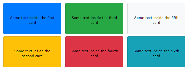
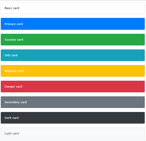
To add a background color the card, use contextual classes (.bg-primary, .bg-success, .bg-info, .bg-warning, .bg-danger, .bg-secondary, .bg-dark and .bg-light


![contextual cars.png](https://cdn.hashnode.com/res/hashnode/image/upload/v1626548538652/uJfahB8lZ.png)


<h5><i>Dropdown:</h5></i>

 A dropdown is a graphical control element, similar to a list box, that allows the user to choose one value from a list.

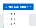
The <code>.dropdown</code> class indicates a dropdown menu.


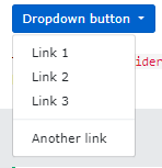
To open the dropdown menu, use a button or a link with a class of <code>.dropdown-toggle </code> and the data-toggle="dropdown" attribute.

Add the <code>.dropdown-menu</code> class to a <div> element to actually build the dropdown menu. Then add the <code> .dropdown-item</code> class to each element (links or buttons) inside the dropdown menu.


![Screenshot 2021-07-17 205851.png](https://cdn.hashnode.com/res/hashnode/image/upload/v1626551952355/QvZGOX8iK.png)

A drop-down divider is represented by a class: <code>.dropdown-divider</code>


![Screenshot 2021-07-17 210132.png](https://cdn.hashnode.com/res/hashnode/image/upload/v1626552114996/EIUOTlHKo.png)

A drop-down header is represented by a class: <code>.dropdown-header</code>


![dropdown head.png](https://cdn.hashnode.com/res/hashnode/image/upload/v1626551849438/WYr35cIY1.png)


A drop-down position is represented by a class: <code>.dropdown dropleft</code> or <code>.dropdown dropright</code>


![left n right.png](https://cdn.hashnode.com/res/hashnode/image/upload/v1626551901140/tbyQDbamx.png)


<h5><i>Collapse:</h5></i>
A collapsible is used to reduce/increase the amount of content shown on a screen

The <code> .collapse</code> class indicates a collapsible element (a <div> in our example); this is the content that will be shown or hidden with a click of a button.

To control the collapsible content, we use the <code> data-toggle="collapse" </code> attribute to an a or a button element. Then add the <code>data-target="#id"</code> attribute to connect the button with the collapsible content <code>(div id="demo")</code>


<h5><i>NavBar:</h5></i>

A navbar is a header placed at the top of the page to give quick links to popular pages on the website.

A standard navigation bar is created with the <code> .navbar class </code>, followed by a responsive collapsing class: <code>.navbar-expand-xl|lg|md|sm </code>(stacks the navbar vertically on extra large, large, medium or small screens).


To add links inside the navbar, use a ul element with <code>class="navbar-nav" </code>. Then add li elements with a <code> .nav-item </code> class followed by an a element with a <code> .nav-link </code> class:


![Screenshot 2021-07-17 210544.png](https://cdn.hashnode.com/res/hashnode/image/upload/v1626552363033/0BtAtiF8A.png)

To add images to your navbar, within your navbar div, add <code> class="navbar-brand" href="#"</code>


![imff.png](https://cdn.hashnode.com/res/hashnode/image/upload/v1626552180988/zkMQxDsEt.png)


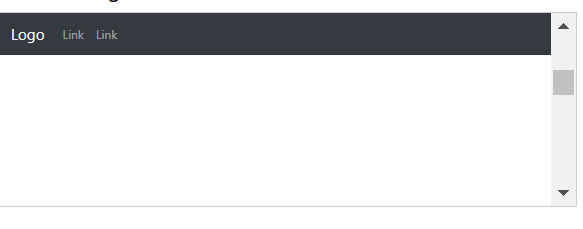
The <code>.fixed-top </code> class makes the navigation bar fixed at the top:

![Screenshot 2021-07-17 210329.png](https://cdn.hashnode.com/res/hashnode/image/upload/v1626552221550/3RI86-a6q.png)

The <code>.sticky-top</code> class to make the navbar fixed/stay at the top of the page when you scroll past it.


<h5><i>Carousel:</h5></i>

A carousel  is a slideshow that displays different images one after the other

Below are the basic indicators for creating a carousel:

<code>.carousel	</code>: Creates a carousel


<code>.carousel-indicators</code>: Adds indicators for the carousel. 


<code>.carousel-inner</code>:	Adds slides to the carousel


<code>.carousel-item</code>:Specifies the content of each slide


<code>.carousel-control-prev</code>: Adds a left (previous) button to the carousel, which allows the user to go back between the slides


<code>.carousel-control-next	</code>:Adds a right (next) button to the carousel, which allows the user to go forward between the slides

<code>.carousel-control-prev-icon</code>: Used together with .carousel-control-prev to create a "previous" button


<code>.carousel-control-next-icon</code>:	Used together with .carousel-control-next to create a "next" button


<code>.slide</code>: Adds a CSS transition and animation effect when sliding from one item to the next. Remove this class if you do not want this effect

Add elements inside <code>div class="carousel-caption"</code> within each <code> div class="carousel-item"</code> to create a caption for each slide


![Screenshot 2021-07-17 210749.png](https://cdn.hashnode.com/res/hashnode/image/upload/v1626552487570/LjNE5eiKR.png)

That's all for now guys!!
Thanks for reading! 😘😘