Bootstrap III 😍😍


Hey everyone!!!
Hope you're not tired of bootstrap yet! There's still a lot more to come!
In this article, we will discuss: buttons, badges, progress bars, spinners and pagination.
Buttons:
Buttons in bootstrap are used to bring attention to a particular part of the website.
The button classes can be used on a, button, or input elements:
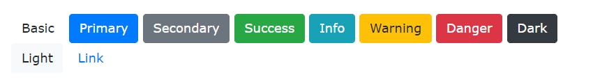
Button Styles
Buttons are styled as such eg button type="button" class="btn btn-primary" Primary button
Bootstrap provides various styles for buttons.
They are:
Buttons can also be outlined
Bootstrap 4 provides eight outline/bordered buttons:
Here is an example:
button type="button" class="btn btn-outline-primary">Primary
The styles are :
Buttons can also be :
- resized
.btn-lg or .btn-sm - block-level(full-width)
.btn-block - active/disabled: The class
.activethedisabled - spinner:
There is spinner-grow
spinner-growand spinner-borderspinner-border
Badges:
A badge is used to add any extra information to a website.
Use the .badge class together with a contextual class (like .badge-secondary ) within elements to create rectangular badges.

.badge-pill class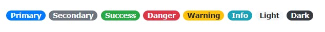
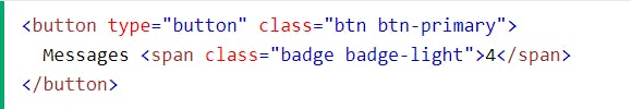
It gives:
Progress Bars:
These are used to show users how far along they are in the process.
They are made functional through Javascript.
The default progress bar is within a div class, as such div class="progress", then within this div is a .progress bar; as such div class="progress-bar"
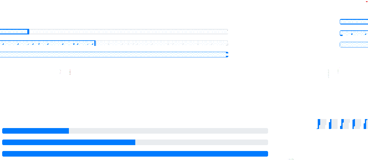
Heights can be modified through an inline CSS within the div tag.
The progress bars can also be loaded to give a percentage as such:
div class="progress-bar" style="width:70%">70%

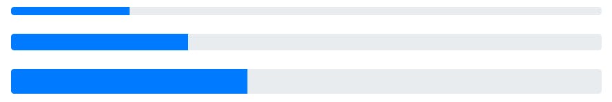
Progress bars can be colored as well within the /progress-bar class. For example: div class="progress-bar bg-success
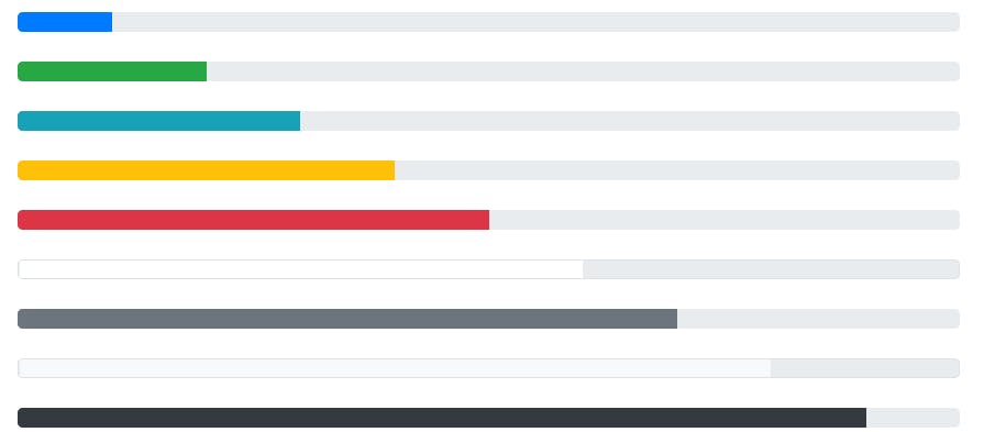
Progress bars can be:
striped using the .progress-bar-striped
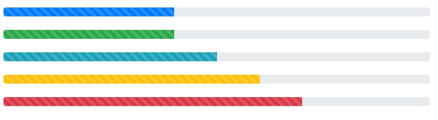
animated using the .progress-bar-animated
stacked by many .progress-bar classes of different widths within the same .progress class.

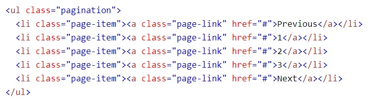
Paginaton:
Pagination is used to divide a website with a lot of pages for easier navigation.
To create a basic pagination, add the .pagination class to an
- element. Then add the .page-item to each
- element and a .page-link class to each link inside
- :
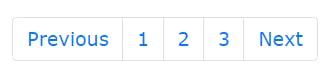
It can be shown as such:
(code):
(result):
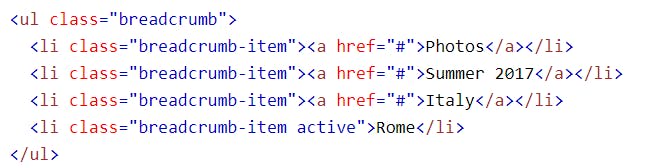
Breadcrumbs:
This is another form of pagination The
.breadcrumband.breadcrumb-itemclasses indicates the current page's location.Shown as thus:
code:
result:

That's all for now!!
Thanks for reading 🥰🥰🥰
Stay tuned for part IV!! 🥵🥵